Case Study
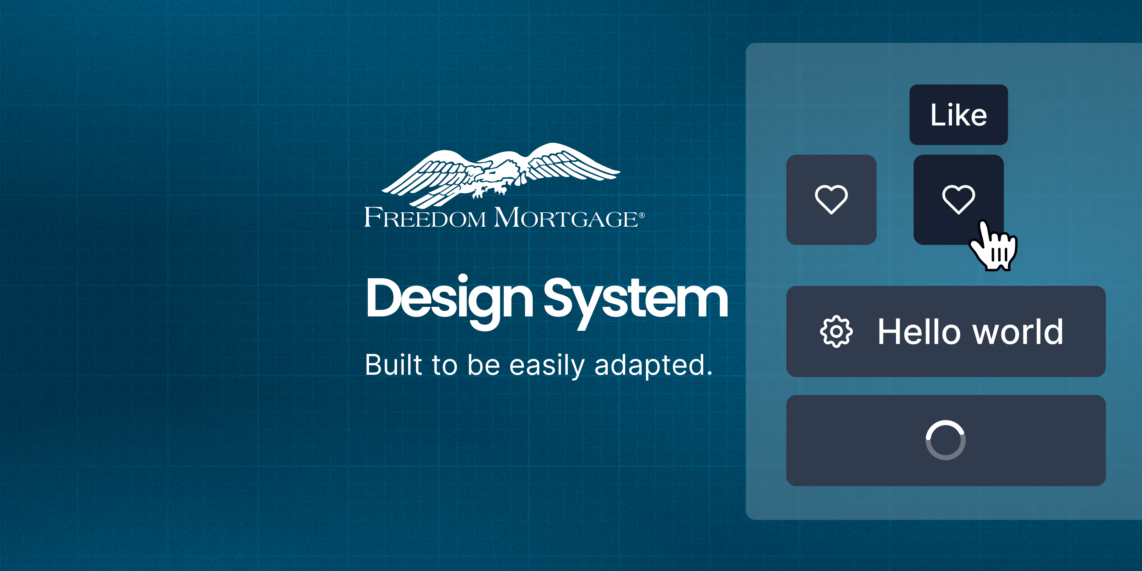
Freedom Mortgage Design System
Unifying Digital Experiences in the Mortgage Industry
Company
Freedom Mortgage
project
Freedom Design System
role
Senior Product Designer
tools
Figma, Miro, Storybook, Confluence
team
UX + IT + Accessibility + Marketing


The Problem We Faced
Across Freedom Mortgage’s growing product suite, design inconsistencies were creating friction at every stage — from ideation to implementation.
Each team had developed its own visual patterns, resulting in duplicated effort, visual fragmentation, and accessibility gaps. Developers often built from scratch. Designers couldn’t reuse components efficiently.
This wasn’t just a UI issue — it was a productivity and scalability challenge. We needed a unified design system to create alignment, reduce rework, and support a consistent, accessible user experience.
Key Challenges
The core issues we needed to address across the organization:
1
Visual Inconsistency
Multiple competing visual styles across products
2
Inefficient Development
Engineers rebuilding similar UI components from scratch
3
Accessibility Gaps
Inconsistent compliance with accessibility standards
4
Slow Design Process
Designers spending too much time recreating basic patterns
Objectives
System Objectives
- Standardize design across platforms
- Build reusable, scalable UI components
- Improve dev/design handoffs
- Embed accessibility into design
- Empower teams to move faster with less rework
My Role
- UI audits and pattern inventories
- Design system strategy and visual language
- Figma library buildout using auto layout + tokens
- Documentation in Confluence
- Collaboration with engineers to build code parity
- Onboarding, education, and system governance
Discovery & Audit: Lifting the Curtain
We started by conducting a full interface audit. Screenshots were taken from every product surface—customer portals, internal dashboards, mobile apps, and marketing sites.
What we found confirmed our instincts:
6+ button styles in production
Inputs with no consistent states (focus, error, success)
WCAG contrast violations on key journeys
Engineering teams building their own UI without alignment
We built a visual component wall in Figma, mapping all the variations side-by-side. This wasn’t just messy — it was unsustainable.
Foundations First
Rather than jump straight into components, we started with foundational decisions — the building blocks of our system.
Color Palette
Colors speak louder than words. Our palette is carefully crafted to convey our brand and enhance usability.
Primary
2.11
9.96 AAA
AAA
Main
blue-500
#00476a
rgb(0, 71, 106)
17.74 AAA
AAA
1.18
Light
blue-50
#e6edf0
rgb(230, 237, 240)
1.35
15.54 AAA
AAA
Dark
blue-800
#00273a
rgb(0, 39, 58)
19.59 AAA
AAA
1.07
ContrastText
neutrals-0
#ffffff
rgb(255, 255, 255)
Secondary
12.93 AAA
AAA
1.62
Main
light blue-500
#6ed8ff
rgb(110, 216, 255)
19.98 AAA
AAA
1.05
Light
light blue-50
#f1fbff
rgb(241, 251, 255)
4.22 AA
4.98 AAA
AA
Dark
light blue-800
#3d778c
rgb(61, 119, 140)
1.37
15.29 AAA
AAA
ContrastText
neutrals-900
#1D3146
rgb(34, 49, 68)
Secondary for Light Background
5.78 AAA
AA
3.64 AA
Main
bb darker-700
#499CC9
rgb(104, 139, 158)
19.80 AAA
AAA
1.06
Light
bb darker-50
#DBEBF4
rgb(244, 249, 252)
2.65
7.92 AAA
AAA
Dark
bb darker-800
#28566f
rgb(40, 86, 111)
19.59 AAA
AAA
1.07
ContrastText
neutrals-0
#ffffff
rgb(255, 255, 255)
Tertiary
10.50 AAA
AAA
2.00
Main
teal-500
#35ccba
rgb(53, 204, 186)
16.78 AAA
AAA
1.25
Light
teal-100
#c0efea
rgb(192, 239, 234)
3.56 AA
5.90 AAA
AA
Dark
teal-800
#1d7066
rgb(29, 112, 102)
16.78 AAA
AAA
1.25
(For Cards)
teal-200
A2E8DF
rgb(162, 232, 223)
Error/Danger
4.67 AAA
AA
4.50 AA
Main
error/danger-500
#d73f3d
rgb(215, 63, 61)
18.31 AAA
AAA
1.15
Light
error/danger-50
#fbecec
rgb(251, 236, 236)
2.03
10.33 AAA
AAA
Dark
error/danger-800
#762322
rgb(118, 35, 34)
Warning
9.19 AAA
AAA
2.29
Main
warning-500
#ed9929
rgb(237, 153, 41)
19.43 AAA
AAA
1.08
Light
warning-50
#fdf5ea
rgb(253, 245, 234)
3.23 AA
6.50 AAA
AA
Dark
warning-800
#825417
rgb(130, 84, 23)
1.37
15.29 AAA
AAA
ContrastText
neutrals-900
#1D3146
rgb(34, 49, 68)
Success
4.52 AAA
AA
4.65 AAA
AA
Main
success-500
#008735
rgb(0, 135, 53)
18.38 AAA
AAA
1.14
Light
success-50
#e6f3eb
rgb(230, 243, 235)
2.00
10.51 AAA
AAA
Dark
success-800
#004a1d
rgb(0, 74, 29)
Neutrals
1.58
13.29 AAA
AAA
Main
mb blue-500
#1d3146
rgb(29, 49, 70)
19.59 AAA
AAA
1.07
Light
neutrals-50
#F8F9FE
rgb(246, 247, 249)
1.27
16.55 AAA
AAA
Dark
neutrals-600
#12202c
rgb(18, 32, 44)
19.59 AAA
AAA
1.07
ContrastText
neutrals-0
#ffffff
rgb(255, 255, 255)
Typography
Typography is the voice of our brand in written form. Here's how we use it to communicate clearly and effectively.
Desktop
Display 1
Canela Text Black, 61 px
Display 2
Canela Text Black, 49 px
Title 1
Poppins SemiBold, 39 px
Title 2
Poppins SemiBold, 31 px
Subtitle 1
Poppins SemiBold, 25 px
Subtitle 2
Poppins SemiBold, 20 px
Paragraph
Poppins Regular, 15 px
Paragraph Bold
Poppins Medium, 15 px
Caption
Poppins Regular, 13 px
Caption Bold
Poppins Medium, 13 px
Form labels
Poppins Medium, 13 px, Title Case
Button Label
Poppins Medium, 15 px Title Case
Button Label Small
Poppins Medium, 13 px Title Case
Link
Poppins Medium, 15 px
Mobile/Tablet
Display 1
Canela Black, 48 px
Display 2
Canela Black, 40 px
Title 1
Poppins SemiBold, 33 px
Title 2
Poppins SemiBold, 28 px
Subtitle 1
Poppins SemiBold, 23 px
Subtitle 2
Poppins SemiBold, 19 px
Paragraph
Poppins Regular, 15 px
Paragraph Bold
Poppins Medium, 15 px
Caption
Poppins Regular, 13 px
Caption Bold
Poppins Medium, 13 px
Form labels
Poppins Medium, 13 px, Title Case
Button Label
Poppins Medium, 15 px Title Case
Button Label Small
Poppins Medium, 13 px Title Case
Link
Poppins Medium, 15 px
Rules for Canela use
Size
Minimum size to use should be 19px
Display 1
Canela Black, 61 px
Display 2
Canela Black, 40 px
Subtitle 2 Bold
Canela Black, 19 px
Numbers
Avoid use Canela for number values
Display 1
1234567890

Display 2
1234567890
Subtitle 2 Bold
1234567890
Grid System and Spacing
A solid structure is the foundation of good design. Our responsive grid system creates balance, rhythm, and clarity across screen sizes — ensuring harmonious layouts and fluid scalability.
Desktop - Big Screens
Layout: 1920px | Grid: 12px | Gutter: 32px | Margin: 189px
Desktop - Small Screens
Layout: 1366px | Grid: 12px | Gutter: 32px | Margin: 32px
Tablet
Layout: 768px | Grid: 8px | Gutter: 32px | Margin: 32px
Mobile
Layout: 320px | Grid: 4px | Gutter: 16px | Margin: 16px
Native Mobile (App)
Layout: 320px | Grid: 4px | Gutter: 16px | Margin: 16px
Columns adjust to screen size while maintaining a consistent gutter and margin system to ensure rhythm and readability.
Layout Spacing
spacing-sm
16px
spacing-md
24px
spacing-lg
32px
spacing-xl
48px
spacing-xl2
64px
spacing-xl3
96px
spacing-xl4
160px
These tokens ensure large-scale spacing is responsive and uniform across different sections of the page.
Component Spacing
spacing-xs2
2px
spacing-xs1
4px
spacing-xs
8px
spacing-sm
16px
spacing-md
24px
spacing-lg
32px
spacing-xl
48px
Use smaller spacings (xs to md) for component-level padding. Larger spacings (lg, xl) are reserved for separating grouped content or major sections.
Best Pratices
- Use Tokens: Always use spacing- tokens to maintain consistency and enable future scalability.
- Scale Up Gracefully: Increase spacing progressively as you move from mobile to desktop for better rhythm and readability.
- Avoid Hardcoded Values: Use design tokens to support theming, responsiveness, and global updates.
Drop Shadow
Shadows add depth and hierarchy to our design. Learn how to use them effectively to create visual interest and guide user attention.
Small
x: 0
y: 2
blur: 4
spread: 0
color: #12202C
opacity: 10%
Medium
x: 0
y: 4
blur: 8
spread: 0
color: #12202C
opacity: 10%
Large
x: 0
y: 8
blur: 16
spread: 0
color: #12202C
opacity: 12%
Border Radius
Consistent corner rounding helps soften our interface and maintain a cohesive look across components. Each radius level serves a distinct purpose depending on the visual weight and function of the element.
Application Guidelines
- Small (8px): Use for interactive elements like buttons and text fields that need just enough rounding for a friendly touch.
- Medium (16px): Ideal for mid-sized containers or overlays to give components a smooth presence without feeling overly rounded.
- Big (32px): Use for large surfaces where bolder rounding helps visually separate them from surrounding UI.
- Full (999px): Reserved for fully circular elements such as profile avatars, icon buttons, or pills.
Small
8px
Medium
16px
Big
32px
Full
999px
Best Pratices
- Use tokens: Always apply the predefined token names (radius-sm, radius-md, etc.) instead of hardcoded values for scalability and theming flexibility.
- Be consistent: Don’t mix multiple radius levels on sibling components unless there’s a functional or visual justification.
- Context is key: Larger radius = friendlier UI. Match the visual tone of the page.
Component System: Designing for Scale
With the foundations in place, we moved to components — thoughtfully crafted, accessibility-ready, and scalable.
We categorized them into:
Core Components
These are atomic, reusable UI elements used throughout products. Built with multiple states, sizes, and accessibility baked in.
Buttons
Buttons are key interactive elements. This section covers our button hierarchy, states, and usage guidelines.
Button Guidelines
Which button type should I pick?
High emphasis
For the primary, most important, or most common action on a screen.
- FAB: The FAB remains the default component for a screen’s primary action. It comes in three sizes: small FAB, FAB, and large FAB. Example actions: Create, Compose.
- Filled button: The filled button’s contrasting surface color makes it the most prominent button after the FAB. It’s used for final or unblocking actions in a flow. Filled buttons have the most visual impact after the FAB, and should be used for important, final actions that complete a flow, like Save, Join now, or Confirm. Example actions: Save, Confirm, Done.
Label

Label

Medium emphasis
For important actions that don’t distract from other onscreen elements.
- Filled tonal button: Filled tonal buttons have a lighter background color and darker label color, making them less visually prominent than a regular, filled button. They’re still used for final or unblocking actions in a flow, but do so with less emphasis. A filled tonal button is an alternative middle ground between filled and outlined buttons. They’re useful in contexts where a lower-priority button requires slightly more emphasis than an outline would give, such as "Next" in an onboarding flow. Tonal buttons use the secondary color mapping. Example actions: Save, Confirm, Done.
Label

Label

- Outlined button: Use an outlined button for actions that need attention but aren’t the primary action, such as See all or Add to cart. This is also the button to use for giving someone the opportunity to change their mind or escape a flow. Example actions: Reply, View all, Add to cart, Take out of trash.
Label

Low emphasis
For optional or supplementary actions with the least amount of prominence
- Text button: Text buttons have less visual prominence, so should be used for low emphasis actions, such as an alternative option. Text buttons are used for the lowest priority actions, especially when presenting multiple options. Text buttons can be placed on a variety of backgrounds. Until the button is interacted with, its container isn’t visible. Example actions: Learn more, View all, Change account, Turn on.
Label
- Icon button: The most compact and subtle type of button, icon buttons are used for optional supplementary actions such as “Bookmark” or “Star.”
Hierarchy
- Primary action button: Each screen should contain a single prominent button for the primary action. This high-emphasis button commands the most attention. The arrangement of on-screen elements should clearly communicate that other buttons are less important.
- Other buttons: A product can show more than one button at a time in a layout. When using multiple buttons, ensure the available state of one button doesn’t resemble the disabled state of another.
Label

Label

Label

Label

Label

Label

Label

Label
Label
Label
Label

Label

Label
Label
Label
Label
Label
Label
Label
Label
Label
Label

Label

Label
Label
Label
Label
Label
Label

Label

Label

Label

Label

Label

Label

Label
Label
Label
Label

Label

Label
Label
Label
Label
Label
Label
Label
Label
Label
Label

Label
Label
Label
Label
Label
Label
Label
Label
Label

Label
Label
Label

Label

Label
Label
Label
Label

Label

Label
Label
Label
Label
Label
Label
Label
Label
Label
Label

Label
Label
Label
Label
Label
Label
Label

Label

Label

Label
Label
Label
Label
Label
Label
Label
Label
Label
Label
Label
Label
Label

Label
Label
Label
Label
Label
Label
Label
Label

Label

Label
Label
Label
Label
Label
Label
Label
Label
Label
Label
Label
Label
Label
Label
Label
Button Specifications
Large
Medium
Small
Label
16


Label

8

8
Label
8

6

16
Label
16
Label
8
8
Label
8
6
16
Label
16
Label

8
8
Label

8
6
16
Chips
Chips help users enter information, make selections, or filter content. Learn about our chip variants and best practices.
Chip
Chip

Chip
Chip

Chip
Chip

Chip
Chip

Chip
Chip

Chip
Chip

Chip
Chip

Chip
Chip

Chip
Chip

Chip
Chip

Chip
Chip
Chip
Chip
Chip
Chip

Chip
Chip

Chip
Chip

Chip
Chip

Chip
Chip
Chip
Chip
Chip
Chip

Chip
Chip

Chip
Chip

Chip
Chip

Chip
Chip

Chip
Chip

Chip
Chip

Chip
Chip

Chip
Chip

Chip
Chip

Chip
Chip

Chip
Chip

Chip
Chip

Chip
Chip

Avatars
Avatars provide visual representation for users. Learn about our avatar styles and usage guidelines.

JS

Alerts/Snackbars
These components communicate important information to users. Discover how to use them for various message types.

Title

Lorem ipsum dolor sit amet, cum sapientem honestatis ea, verear labores feugait sea in, cu justo suscipiantur mel.
ACTION

Title

Lorem ipsum dolor sit amet, cum sapientem honestatis ea, verear labores feugait sea in, cu justo suscipiantur mel.
ACTION

Title
Lorem ipsum dolor sit amet, cum sapientem honestatis ea, verear labores feugait sea in, cu justo suscipiantur mel.
ACTION

Title

Lorem ipsum dolor sit amet, cum sapientem honestatis ea, verear labores feugait sea in, cu justo suscipiantur mel.
ACTION

Title

Lorem ipsum dolor sit amet, cum sapientem honestatis ea, verear labores feugait sea in, cu justo suscipiantur mel.
ACTION

Title
Lorem ipsum dolor sit amet, cum sapientem honestatis ea, verear labores feugait sea in, cu justo suscipiantur mel.
ACTION

Title

Lorem ipsum dolor sit amet, cum sapientem honestatis ea, verear labores feugait sea in, cu justo suscipiantur mel.
ACTION

Title

Lorem ipsum dolor sit amet, cum sapientem honestatis ea, verear labores feugait sea in, cu justo suscipiantur mel.
ACTION

Title
Lorem ipsum dolor sit amet, cum sapientem honestatis ea, verear labores feugait sea in, cu justo suscipiantur mel.
ACTION

Title

Lorem ipsum dolor sit amet, cum sapientem honestatis ea, verear labores feugait sea in, cu justo suscipiantur mel.
ACTION

Title

Lorem ipsum dolor sit amet, cum sapientem honestatis ea, verear labores feugait sea in, cu justo suscipiantur mel.
ACTION

Title
Lorem ipsum dolor sit amet, cum sapientem honestatis ea, verear labores feugait sea in, cu justo suscipiantur mel.
ACTION
This is a Title
Action
Title
Action
Title
Action
This is a Title
Action
Title
Action
Title
Action

This is a Title
Action
Title
Action
Title
Action
This is a Title
Action
Title
Action
Title
Action
Developer Collaboration
We partnered with engineering to build out the components in code (React), using:
- Design tokens for consistent theming
- Storybook to preview and test component behavior
- Continuous handoffs via Figma → Zeroheight → Git
Documentation & Adoption
We launched the system with clear, actionable documentation including:
Documentation Features
- Do/Don't usage examples for each component
- Code references with React props and examples
- Accessibility notes for proper implementation
- Embedded design tokens for reference
System in Action
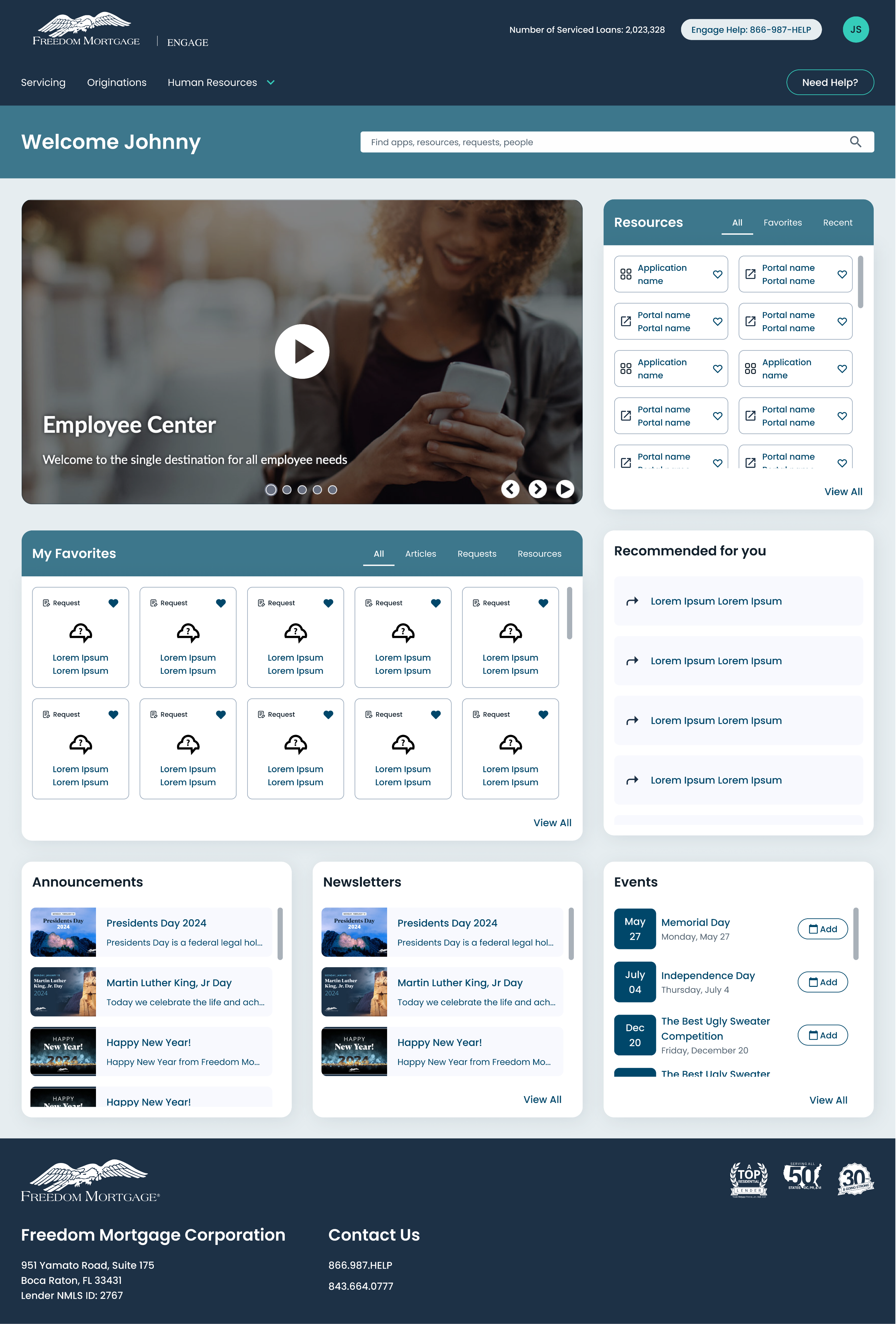
The design system quickly became the foundation for product redesigns like the Engage portal. It allowed for:
- Rapid prototyping
- Faster dev cycles
- Consistent, accessible UI across platforms
Key Takeaways
Design systems are adoption-driven
Evangelizing internally was as important as building. We spent significant time onboarding teams and providing support.
Good documentation is as critical as good design
Clear guidelines with examples ensured teams could implement components correctly without constant handholding.
Tokens are your best friend
They allowed seamless scaling across themes and platforms, making it easier to maintain visual consistency.
Impact
The system was recognized internally as a key enabler of product consistency and scalability.
Design Consistency
100%
Visual consistency across new product features
Dev Time
68%
Reduction in UI implementation time
Accessibility
WCAG 2.1
All components meet AA standards
Design Time
4x
Faster prototyping and design iterations
Adoption
93%
Of product teams utilizing the system
Components
60+
Reusable UI components in the library
Final Thought
"This design system wasn't just a file or a library—it was an operating system for our product team. It helped us scale faster, build cleaner, and design with clarity."
— Twinkle Mohan, Lead Product Designer

Other Projects
See Project
→
See Project
→
Coming Soon

Connect with me to explore new design opportunities.


CONTACT
Twinkle Mohan
TM


Menu
Work
About
Contact


Case Study
Freedom Mortgage Design System
Unifying Digital Experiences in the Mortgage Industry
project
Freedom Design System
Company
Freedom Mortgage
role
Senior Product Designer
tools
Figma, Miro, Storybook, Confluence
team
UX + IT + Accessibility + Marketing


Freedom Mortgage Design System
Built to be easily adapted.

Hello world
Hello world


Like
Like

The Problem We Faced
Across Freedom Mortgage’s growing product suite, design inconsistencies were creating friction at every stage — from ideation to implementation.
Each team had developed its own visual patterns, resulting in duplicated effort, visual fragmentation, and accessibility gaps. Developers often built from scratch. Designers couldn’t reuse components efficiently.
This wasn’t just a UI issue — it was a productivity and scalability challenge. We needed a unified design system to create alignment, reduce rework, and support a consistent, accessible user experience.
Key Challenges
The core issues we needed to address across the organization:
1
Visual Inconsistency
Multiple competing visual styles across products
2
Inefficient Development
Engineers rebuilding similar UI components from scratch
3
Accessibility Gaps
Inconsistent compliance with accessibility standards
4
Slow Design Process
Designers spending too much time recreating basic patterns
Objectives
System Objectives
- Standardize design across platforms
- Build reusable, scalable UI components
- Improve dev/design handoffs
- Embed accessibility into design
- Empower teams to move faster with less rework
My Role
- UI audits and pattern inventories
- Design system strategy and visual language
- Figma library buildout using auto layout + tokens
- Documentation in Confluence
- Collaboration with engineers to build code parity
- Onboarding, education, and system governance
Discovery & Audit: Lifting the Curtain
We started by conducting a full interface audit. Screenshots were taken from every product surface—customer portals, internal dashboards, mobile apps, and marketing sites.
What we found confirmed our instincts:
6+ button styles in production
Inputs with no consistent states (focus, error, success)
WCAG contrast violations on key journeys
Engineering teams building their own UI without alignment
We built a visual component wall in Figma, mapping all the variations side-by-side. This wasn’t just messy — it was unsustainable.
Foundations First
Rather than jump straight into components, we started with foundational decisions — the building blocks of our system.
Color Palette
Colors speak louder than words. Our palette is carefully crafted to convey our brand and enhance usability.
Primary
2.11
9.96 AAA
AAA
Main
blue-500
#00476a
rgb(0, 71, 106)
17.74 AAA
AAA
1.18
Light
blue-50
#e6edf0
rgb(230, 237, 240)
1.35
15.54 AAA
AAA
Dark
blue-800
#00273a
rgb(0, 39, 58)
19.59 AAA
AAA
1.07
ContrastText
neutrals-0
#ffffff
rgb(255, 255, 255)
Secondary
12.93 AAA
AAA
1.62
Main
light blue-500
#6ed8ff
rgb(110, 216, 255)
19.98 AAA
AAA
1.05
Light
light blue-50
#f1fbff
rgb(241, 251, 255)
4.22 AA
4.98 AAA
AA
Dark
light blue-800
#3d778c
rgb(61, 119, 140)
1.37
15.29 AAA
AAA
ContrastText
neutrals-900
#1D3146
rgb(34, 49, 68)
Secondary for Light Background
5.78 AAA
AA
3.64 AA
Main
bb darker-700
#499CC9
rgb(104, 139, 158)
19.80 AAA
AAA
1.06
Light
bb darker-50
#DBEBF4
rgb(244, 249, 252)
2.65
7.92 AAA
AAA
Dark
bb darker-800
#28566f
rgb(40, 86, 111)
19.59 AAA
AAA
1.07
ContrastText
neutrals-0
#ffffff
rgb(255, 255, 255)
Tertiary
10.50 AAA
AAA
2.00
Main
teal-500
#35ccba
rgb(53, 204, 186)
16.78 AAA
AAA
1.25
Light
teal-100
#c0efea
rgb(192, 239, 234)
3.56 AA
5.90 AAA
AA
Dark
teal-800
#1d7066
rgb(29, 112, 102)
16.78 AAA
AAA
1.25
(For Cards)
teal-200
A2E8DF
rgb(162, 232, 223)
Error/Danger
4.67 AAA
AA
4.50 AA
Main
error/danger-500
#d73f3d
rgb(215, 63, 61)
18.31 AAA
AAA
1.15
Light
error/danger-50
#fbecec
rgb(251, 236, 236)
2.03
10.33 AAA
AAA
Dark
error/danger-800
#762322
rgb(118, 35, 34)
Warning
9.19 AAA
AAA
2.29
Main
warning-500
#ed9929
rgb(237, 153, 41)
19.43 AAA
AAA
1.08
Light
warning-50
#fdf5ea
rgb(253, 245, 234)
3.23 AA
6.50 AAA
AA
Dark
warning-800
#825417
rgb(130, 84, 23)
1.37
15.29 AAA
AAA
ContrastText
neutrals-900
#1D3146
rgb(34, 49, 68)
Success
4.52 AAA
AA
4.65 AAA
AA
Main
success-500
#008735
rgb(0, 135, 53)
18.38 AAA
AAA
1.14
Light
success-50
#e6f3eb
rgb(230, 243, 235)
2.00
10.51 AAA
AAA
Dark
success-800
#004a1d
rgb(0, 74, 29)
Neutrals
1.58
13.29 AAA
AAA
Main
mb blue-500
#1d3146
rgb(29, 49, 70)
19.59 AAA
AAA
1.07
Light
neutrals-50
#F8F9FE
rgb(246, 247, 249)
1.27
16.55 AAA
AAA
Dark
neutrals-600
#12202c
rgb(18, 32, 44)
19.59 AAA
AAA
1.07
ContrastText
neutrals-0
#ffffff
rgb(255, 255, 255)
Typography
Typography is the voice of our brand in written form. Here's how we use it to communicate clearly and effectively.
Desktop
Display 1
Canela Text Black, 61 px
Display 2
Canela Text Black, 49 px
Title 1
Poppins SemiBold, 39 px
Title 2
Poppins SemiBold, 31 px
Subtitle 1
Poppins SemiBold, 25 px
Subtitle 2
Poppins SemiBold, 20 px
Paragraph
Poppins Regular, 15 px
Paragraph Bold
Poppins Medium, 15 px
Caption
Poppins Regular, 13 px
Caption Bold
Poppins Medium, 13 px
Form labels
Poppins Medium, 13 px, Title Case
Button Label
Poppins Medium, 15 px Title Case
Button Label Small
Poppins Medium, 13 px Title Case
Link
Poppins Medium, 15 px
Mobile/Tablet
Display 1
Canela Black, 48 px
Display 2
Canela Black, 40 px
Title 1
Poppins SemiBold, 33 px
Title 2
Poppins SemiBold, 28 px
Subtitle 1
Poppins SemiBold, 23 px
Subtitle 2
Poppins SemiBold, 19 px
Paragraph
Poppins Regular, 15 px
Paragraph Bold
Poppins Medium, 15 px
Caption
Poppins Regular, 13 px
Caption Bold
Poppins Medium, 13 px
Form labels
Poppins Medium, 13 px, Title Case
Button Label
Poppins Medium, 15 px Title Case
Button Label Small
Poppins Medium, 13 px Title Case
Link
Poppins Medium, 15 px
Rules for Canela use
Size
Minimum size to use should be 19px
Display 1
Canela Black, 61 px
Display 2
Canela Black, 40 px
Subtitle 2 Bold
Canela Black, 19 px
Numbers
Avoid use Canela for number values
Display 1
1234567890
Display 2
1234567890
Subtitle 2 Bold
1234567890
Grid System and Spacing
A solid structure is the foundation of good design. Our responsive grid system creates balance, rhythm, and clarity across screen sizes — ensuring harmonious layouts and fluid scalability.
Desktop - Big Screens
Layout: 1920px | Grid: 12px | Gutter: 32px | Margin: 189px
Desktop - Small Screens
Layout: 1366px | Grid: 12px | Gutter: 32px | Margin: 32px
Tablet
Layout: 768px | Grid: 8px | Gutter: 32px | Margin: 32px
Mobile
Layout: 320px | Grid: 4px | Gutter: 16px | Margin: 16px
Native Mobile (App)
Layout: 320px | Grid: 4px | Gutter: 16px | Margin: 16px
Columns adjust to screen size while maintaining a consistent gutter and margin system to ensure rhythm and readability.
Layout Spacing
spacing-sm
16px
spacing-md
24px
spacing-lg
32px
spacing-xl
48px
spacing-xl2
64px
spacing-xl3
96px
spacing-xl4
160px
These tokens ensure large-scale spacing is responsive and uniform across different sections of the page.
Component Spacing
spacing-xs2
2px
spacing-xs1
4px
spacing-xs
8px
spacing-sm
16px
spacing-md
24px
spacing-lg
32px
spacing-xl
48px
Use smaller spacings (xs to md) for component-level padding. Larger spacings (lg, xl) are reserved for separating grouped content or major sections.
Best Pratices
- Use Tokens: Always use spacing- tokens to maintain consistency and enable future scalability.
- Scale Up Gracefully: Increase spacing progressively as you move from mobile to desktop for better rhythm and readability.
- Avoid Hardcoded Values: Use design tokens to support theming, responsiveness, and global updates.
Drop Shadow
Shadows add depth and hierarchy to our design. Learn how to use them effectively to create visual interest and guide user attention.
Small
x: 0
y: 2
blur: 4
spread: 0
color: #12202C
opacity: 10%
Medium
x: 0
y: 4
blur: 8
spread: 0
color: #12202C
opacity: 10%
Large
x: 0
y: 8
blur: 16
spread: 0
color: #12202C
opacity: 12%
Border Radius
Consistent corner rounding helps soften our interface and maintain a cohesive look across components. Each radius level serves a distinct purpose depending on the visual weight and function of the element.
Application Guidelines
- Small (8px): Use for interactive elements like buttons and text fields that need just enough rounding for a friendly touch.
- Medium (16px): Ideal for mid-sized containers or overlays to give components a smooth presence without feeling overly rounded.
- Big (32px): Use for large surfaces where bolder rounding helps visually separate them from surrounding UI.
- Full (999px): Reserved for fully circular elements such as profile avatars, icon buttons, or pills.
Small
8px
Medium
16px
Big
32px
Full
999px
Best Pratices
- Use tokens: Always apply the predefined token names (radius-sm, radius-md, etc.) instead of hardcoded values for scalability and theming flexibility.
- Be consistent: Don’t mix multiple radius levels on sibling components unless there’s a functional or visual justification.
- Context is key: Larger radius = friendlier UI. Match the visual tone of the page.
Component System: Designing for Scale
With the foundations in place, we moved to components — thoughtfully crafted, accessibility-ready, and scalable.
We categorized them into:
Core Components
These are atomic, reusable UI elements used throughout products. Built with multiple states, sizes, and accessibility baked in.
Buttons
Buttons are key interactive elements. This section covers our button hierarchy, states, and usage guidelines.
Button Guidelines
Which button type should I pick?
High emphasis
For the primary, most important, or most common action on a screen.
- FAB: The FAB remains the default component for a screen’s primary action. It comes in three sizes: small FAB, FAB, and large FAB. Example actions: Create, Compose.
- Filled button: The filled button’s contrasting surface color makes it the most prominent button after the FAB. It’s used for final or unblocking actions in a flow. Filled buttons have the most visual impact after the FAB, and should be used for important, final actions that complete a flow, like Save, Join now, or Confirm. Example actions: Save, Confirm, Done.
Label
Label
Medium emphasis
For important actions that don’t distract from other onscreen elements.
- Filled tonal button: Filled tonal buttons have a lighter background color and darker label color, making them less visually prominent than a regular, filled button. They’re still used for final or unblocking actions in a flow, but do so with less emphasis. A filled tonal button is an alternative middle ground between filled and outlined buttons. They’re useful in contexts where a lower-priority button requires slightly more emphasis than an outline would give, such as "Next" in an onboarding flow. Tonal buttons use the secondary color mapping. Example actions: Save, Confirm, Done.
Label
Label
- Outlined button: Use an outlined button for actions that need attention but aren’t the primary action, such as See all or Add to cart. This is also the button to use for giving someone the opportunity to change their mind or escape a flow. Example actions: Reply, View all, Add to cart, Take out of trash.
Label
Low emphasis
For optional or supplementary actions with the least amount of prominence
- Text button: Text buttons have less visual prominence, so should be used for low emphasis actions, such as an alternative option. Text buttons are used for the lowest priority actions, especially when presenting multiple options. Text buttons can be placed on a variety of backgrounds. Until the button is interacted with, its container isn’t visible. Example actions: Learn more, View all, Change account, Turn on.
Label
- Icon button: The most compact and subtle type of button, icon buttons are used for optional supplementary actions such as “Bookmark” or “Star.”
Hierarchy
- Primary action button: Each screen should contain a single prominent button for the primary action. This high-emphasis button commands the most attention. The arrangement of on-screen elements should clearly communicate that other buttons are less important.
- Other buttons: A product can show more than one button at a time in a layout. When using multiple buttons, ensure the available state of one button doesn’t resemble the disabled state of another.
Label
Label
Label
Label
Label
Label
Label
Label
Label
Label
Label
Label
Label
Label
Label
Label
Label
Label
Label
Label
Label
Label
Label
Label
Label
Label
Label
Label
Label
Label
Label
Label
Label
Label
Label
Label
Label
Label
Label
Label
Label
Label
Label
Label
Label
Label
Label
Label
Label
Label
Label
Label
Label
Label
Label
Label
Label
Label
Label
Label
Label
Label
Label
Label
Label
Label
Label
Label
Label
Label
Label
Label
Label
Label
Label
Label
Label
Label
Label
Label
Label
Label
Label
Label
Label
Label
Label
Label
Label
Label
Label
Label
Label
Label
Label
Label
Label
Label
Label
Label
Label
Label
Label
Label
Label
Label
Label
Label
Label
Label
Label
Label
Label
Label
Label
Label
Label
Label
Label
Label
Label
Label
Label
Label
Button Specifications
Large
Medium
Small
Label
16
Label
8
8
Label
8
6
16
Label
16
Label
8
8
Label
8
6
16
Label
16
Label
8
8
Label
8
6
16
Chips
Chips help users enter information, make selections, or filter content. Learn about our chip variants and best practices.
Chip
Chip
Chip
Chip
Chip
Chip
Chip
Chip
Chip
Chip
Chip
Chip
Chip
Chip
Chip
Chip
Chip
Chip
Chip
Chip
Chip
Chip
Chip
Chip
Chip
Chip
Chip
Chip
Chip
Chip
Chip
Chip
Chip
Chip
Chip
Chip
Chip
Chip
Chip
Chip
Chip
Chip
Chip
Chip
Chip
Chip
Chip
Chip
Chip
Chip
Chip
Chip
Chip
Chip
Chip
Chip
Chip
Chip
Chip
Chip
Chip
Chip
Chip
Chip
Avatars
Avatars provide visual representation for users. Learn about our avatar styles and usage guidelines.
JS
Alerts/Snackbars
These components communicate important information to users. Discover how to use them for various message types.
Title
Lorem ipsum dolor sit amet, cum sapientem honestatis ea, verear labores feugait sea in, cu justo suscipiantur mel.
ACTION
Title
Lorem ipsum dolor sit amet, cum sapientem honestatis ea, verear labores feugait sea in, cu justo suscipiantur mel.
ACTION
Title
Lorem ipsum dolor sit amet, cum sapientem honestatis ea, verear labores feugait sea in, cu justo suscipiantur mel.
ACTION
Title
Lorem ipsum dolor sit amet, cum sapientem honestatis ea, verear labores feugait sea in, cu justo suscipiantur mel.
ACTION
Title
Lorem ipsum dolor sit amet, cum sapientem honestatis ea, verear labores feugait sea in, cu justo suscipiantur mel.
ACTION
Title
Lorem ipsum dolor sit amet, cum sapientem honestatis ea, verear labores feugait sea in, cu justo suscipiantur mel.
ACTION
Title
Lorem ipsum dolor sit amet, cum sapientem honestatis ea, verear labores feugait sea in, cu justo suscipiantur mel.
ACTION
Title
Lorem ipsum dolor sit amet, cum sapientem honestatis ea, verear labores feugait sea in, cu justo suscipiantur mel.
ACTION
Title
Lorem ipsum dolor sit amet, cum sapientem honestatis ea, verear labores feugait sea in, cu justo suscipiantur mel.
ACTION
Title
Lorem ipsum dolor sit amet, cum sapientem honestatis ea, verear labores feugait sea in, cu justo suscipiantur mel.
ACTION
Title
Lorem ipsum dolor sit amet, cum sapientem honestatis ea, verear labores feugait sea in, cu justo suscipiantur mel.
ACTION
Title
Lorem ipsum dolor sit amet, cum sapientem honestatis ea, verear labores feugait sea in, cu justo suscipiantur mel.
ACTION
This is a Title
Action
Title
Action
Title
Action
This is a Title
Action
Title
Action
Title
Action
This is a Title
Action
Title
Action
Title
Action
This is a Title
Action
Title
Action
Title
Action
Developer Collaboration
We partnered with engineering to build out the components in code (React), using:
- Design tokens for consistent theming
- Storybook to preview and test component behavior
- Continuous handoffs via Figma → Zeroheight → Git
Documentation & Adoption
We launched the system with clear, actionable documentation including:
Documentation Features
- Do/Don't usage examples for each component
- Code references with React props and examples
- Accessibility notes for proper implementation
- Embedded design tokens for reference
System in Action
The design system quickly became the foundation for product redesigns like the Engage portal. It allowed for:
- Rapid prototyping
- Faster dev cycles
- Consistent, accessible UI across platforms
Key Takeaways
Design systems are adoption-driven
Evangelizing internally was as important as building. We spent significant time onboarding teams and providing support.
Good documentation is as critical as good design
Clear guidelines with examples ensured teams could implement components correctly without constant handholding.
Tokens are your best friend
They allowed seamless scaling across themes and platforms, making it easier to maintain visual consistency.
Impact
The system was recognized internally as a key enabler of product consistency and scalability.
Design Consistency
100%
Visual consistency across new product features
Dev Time
68%
Reduction in UI implementation time
Accessibility
WCAG 2.1
All components meet AA standards
Design Time
4x
Faster prototyping and design iterations
Adoption
93%
Of product teams utilizing the system
Components
60+
Reusable UI components in the library
Final Thought
"This design system wasn't just a file or a library—it was an operating system for our product team. It helped us scale faster, build cleaner, and design with clarity."
— Twinkle Mohan, Lead Product Designer

Other Projects
See Project
→
See Project
→
Coming Soon
→

Connect with me to explore new design opportunities.

CONTACT
Twinkle Mohan
Case Study
Freedom Mortgage Design System
Unifying Digital Experiences in the Mortgage Industry
project
Freedom Design System
Company
Freedom Mortgage
role
Senior Product Designer
tools
Figma, Miro, Storybook, Confluence
team
UX + IT + Accessibility + Marketing
Freedom Mortgage Design System
Built to be easily adapted.
Hello world
Hello world
Like
Like
The Problem We Faced
Across Freedom Mortgage’s growing product suite, design inconsistencies were creating friction at every stage — from ideation to implementation.
Each team had developed its own visual patterns, resulting in duplicated effort, visual fragmentation, and accessibility gaps. Developers often built from scratch. Designers couldn’t reuse components efficiently.
This wasn’t just a UI issue — it was a productivity and scalability challenge. We needed a unified design system to create alignment, reduce rework, and support a consistent, accessible user experience.
Key Challenges
The core issues we needed to address across the organization:
1
Visual Inconsistency
Multiple competing visual styles across products
2
Inefficient Development
Engineers rebuilding similar UI components from scratch
3
Accessibility Gaps
Inconsistent compliance with accessibility standards
4
Slow Design Process
Designers spending too much time recreating basic patterns
Objectives
System Objectives
- Standardize design across platforms
- Build reusable, scalable UI components
- Improve dev/design handoffs
- Embed accessibility into design
- Empower teams to move faster with less rework
My Role
- UI audits and pattern inventories
- Design system strategy and visual language
- Figma library buildout using auto layout + tokens
- Documentation in Confluence
- Collaboration with engineers to build code parity
- Onboarding, education, and system governance
Discovery & Audit: Lifting the Curtain
We started by conducting a full interface audit. Screenshots were taken from every product surface—customer portals, internal dashboards, mobile apps, and marketing sites.
What we found confirmed our instincts:
6+ button styles in production
Inputs with no consistent states (focus, error, success)
WCAG contrast violations on key journeys
Engineering teams building their own UI without alignment
We built a visual component wall in Figma, mapping all the variations side-by-side. This wasn’t just messy — it was unsustainable.
Foundations First
Rather than jump straight into components, we started with foundational decisions — the building blocks of our system.
Color Palette
Colors speak louder than words. Our palette is carefully crafted to convey our brand and enhance usability.
Primary
2.11
9.96 AAA
AAA
Main
blue-500
#00476a
rgb(0, 71, 106)
17.74 AAA
AAA
1.18
Light
blue-50
#e6edf0
rgb(230, 237, 240)
1.35
15.54 AAA
AAA
Dark
blue-800
#00273a
rgb(0, 39, 58)
19.59 AAA
AAA
1.07
ContrastText
neutrals-0
#ffffff
rgb(255, 255, 255)
Secondary
12.93 AAA
AAA
1.62
Main
light blue-500
#6ed8ff
rgb(110, 216, 255)
19.98 AAA
AAA
1.05
Light
light blue-50
#f1fbff
rgb(241, 251, 255)
4.22 AA
4.98 AAA
AA
Dark
light blue-800
#3d778c
rgb(61, 119, 140)
1.37
15.29 AAA
AAA
ContrastText
neutrals-900
#1D3146
rgb(34, 49, 68)
Secondary for Light Background
5.78 AAA
AA
3.64 AA
Main
bb darker-700
#499CC9
rgb(104, 139, 158)
19.80 AAA
AAA
1.06
Light
bb darker-50
#DBEBF4
rgb(244, 249, 252)
2.65
7.92 AAA
AAA
Dark
bb darker-800
#28566f
rgb(40, 86, 111)
19.59 AAA
AAA
1.07
ContrastText
neutrals-0
#ffffff
rgb(255, 255, 255)
Tertiary
10.50 AAA
AAA
2.00
Main
teal-500
#35ccba
rgb(53, 204, 186)
16.78 AAA
AAA
1.25
Light
teal-100
#c0efea
rgb(192, 239, 234)
3.56 AA
5.90 AAA
AA
Dark
teal-800
#1d7066
rgb(29, 112, 102)
16.78 AAA
AAA
1.25
(For Cards)
teal-200
A2E8DF
rgb(162, 232, 223)
Error/Danger
4.67 AAA
AA
4.50 AA
Main
error/danger-500
#d73f3d
rgb(215, 63, 61)
18.31 AAA
AAA
1.15
Light
error/danger-50
#fbecec
rgb(251, 236, 236)
2.03
10.33 AAA
AAA
Dark
error/danger-800
#762322
rgb(118, 35, 34)
Warning
9.19 AAA
AAA
2.29
Main
warning-500
#ed9929
rgb(237, 153, 41)
19.43 AAA
AAA
1.08
Light
warning-50
#fdf5ea
rgb(253, 245, 234)
3.23 AA
6.50 AAA
AA
Dark
warning-800
#825417
rgb(130, 84, 23)
1.37
15.29 AAA
AAA
ContrastText
neutrals-900
#1D3146
rgb(34, 49, 68)
Success
4.52 AAA
AA
4.65 AAA
AA
Main
success-500
#008735
rgb(0, 135, 53)
18.38 AAA
AAA
1.14
Light
success-50
#e6f3eb
rgb(230, 243, 235)
2.00
10.51 AAA
AAA
Dark
success-800
#004a1d
rgb(0, 74, 29)
Neutrals
1.58
13.29 AAA
AAA
Main
mb blue-500
#1d3146
rgb(29, 49, 70)
19.59 AAA
AAA
1.07
Light
neutrals-50
#F8F9FE
rgb(246, 247, 249)
1.27
16.55 AAA
AAA
Dark
neutrals-600
#12202c
rgb(18, 32, 44)
19.59 AAA
AAA
1.07
ContrastText
neutrals-0
#ffffff
rgb(255, 255, 255)
Typography
Typography is the voice of our brand in written form. Here's how we use it to communicate clearly and effectively.
Desktop
Display 1
Canela Text Black, 61 px
Display 2
Canela Text Black, 49 px
Title 1
Poppins SemiBold, 39 px
Title 2
Poppins SemiBold, 31 px
Subtitle 1
Poppins SemiBold, 25 px
Subtitle 2
Poppins SemiBold, 20 px
Paragraph
Poppins Regular, 15 px
Paragraph Bold
Poppins Medium, 15 px
Caption
Poppins Regular, 13 px
Caption Bold
Poppins Medium, 13 px
Form labels
Poppins Medium, 13 px, Title Case
Button Label
Poppins Medium, 15 px Title Case
Button Label Small
Poppins Medium, 13 px Title Case
Link
Poppins Medium, 15 px
Mobile/Tablet
Display 1
Canela Black, 48 px
Display 2
Canela Black, 40 px
Title 1
Poppins SemiBold, 33 px
Title 2
Poppins SemiBold, 28 px
Subtitle 1
Poppins SemiBold, 23 px
Subtitle 2
Poppins SemiBold, 19 px
Paragraph
Poppins Regular, 15 px
Paragraph Bold
Poppins Medium, 15 px
Caption
Poppins Regular, 13 px
Caption Bold
Poppins Medium, 13 px
Form labels
Poppins Medium, 13 px, Title Case
Button Label
Poppins Medium, 15 px Title Case
Button Label Small
Poppins Medium, 13 px Title Case
Link
Poppins Medium, 15 px
Rules for Canela use
Size
Minimum size to use should be 19px
Display 1
Canela Black, 61 px
Display 2
Canela Black, 40 px
Subtitle 2 Bold
Canela Black, 19 px
Numbers
Avoid use Canela for number values
Display 1
1234567890
Display 2
1234567890
Subtitle 2 Bold
1234567890
Grid System and Spacing
A solid structure is the foundation of good design. Our responsive grid system creates balance, rhythm, and clarity across screen sizes — ensuring harmonious layouts and fluid scalability.
Desktop - Big Screens
Layout: 1920px | Grid: 12px | Gutter: 32px | Margin: 189px
Desktop - Small Screens
Layout: 1366px | Grid: 12px | Gutter: 32px | Margin: 32px
Tablet
Layout: 768px | Grid: 8px | Gutter: 32px | Margin: 32px
Mobile
Layout: 320px | Grid: 4px | Gutter: 16px | Margin: 16px
Native Mobile (App)
Layout: 320px | Grid: 4px | Gutter: 16px | Margin: 16px
Columns adjust to screen size while maintaining a consistent gutter and margin system to ensure rhythm and readability.
Layout Spacing
spacing-sm
16px
spacing-md
24px
spacing-lg
32px
spacing-xl
48px
spacing-xl2
64px
spacing-xl3
96px
spacing-xl4
160px
These tokens ensure large-scale spacing is responsive and uniform across different sections of the page.
Component Spacing
spacing-xs2
2px
spacing-xs1
4px
spacing-xs
8px
spacing-sm
16px
spacing-md
24px
spacing-lg
32px
spacing-xl
48px
Use smaller spacings (xs to md) for component-level padding. Larger spacings (lg, xl) are reserved for separating grouped content or major sections.
Best Pratices
- Use Tokens: Always use spacing- tokens to maintain consistency and enable future scalability.
- Scale Up Gracefully: Increase spacing progressively as you move from mobile to desktop for better rhythm and readability.
- Avoid Hardcoded Values: Use design tokens to support theming, responsiveness, and global updates.
Drop Shadow
Shadows add depth and hierarchy to our design. Learn how to use them effectively to create visual interest and guide user attention.
Small
x: 0
y: 2
blur: 4
spread: 0
color: #12202C
opacity: 10%
Medium
x: 0
y: 4
blur: 8
spread: 0
color: #12202C
opacity: 10%
Large
x: 0
y: 8
blur: 16
spread: 0
color: #12202C
opacity: 12%
Border Radius
Consistent corner rounding helps soften our interface and maintain a cohesive look across components. Each radius level serves a distinct purpose depending on the visual weight and function of the element.
Application Guidelines
- Small (8px): Use for interactive elements like buttons and text fields that need just enough rounding for a friendly touch.
- Medium (16px): Ideal for mid-sized containers or overlays to give components a smooth presence without feeling overly rounded.
- Big (32px): Use for large surfaces where bolder rounding helps visually separate them from surrounding UI.
- Full (999px): Reserved for fully circular elements such as profile avatars, icon buttons, or pills.
Small
8px
Medium
16px
Big
32px
Full
999px
Best Pratices
- Use tokens: Always apply the predefined token names (radius-sm, radius-md, etc.) instead of hardcoded values for scalability and theming flexibility.
- Be consistent: Don’t mix multiple radius levels on sibling components unless there’s a functional or visual justification.
- Context is key: Larger radius = friendlier UI. Match the visual tone of the page.
Component System: Designing for Scale
With the foundations in place, we moved to components — thoughtfully crafted, accessibility-ready, and scalable.
We categorized them into:
Core Components
These are atomic, reusable UI elements used throughout products. Built with multiple states, sizes, and accessibility baked in.
Buttons
Buttons are key interactive elements. This section covers our button hierarchy, states, and usage guidelines.
Button Guidelines
Which button type should I pick?
High emphasis
For the primary, most important, or most common action on a screen.
- FAB: The FAB remains the default component for a screen’s primary action. It comes in three sizes: small FAB, FAB, and large FAB. Example actions: Create, Compose.
- Filled button: The filled button’s contrasting surface color makes it the most prominent button after the FAB. It’s used for final or unblocking actions in a flow. Filled buttons have the most visual impact after the FAB, and should be used for important, final actions that complete a flow, like Save, Join now, or Confirm. Example actions: Save, Confirm, Done.
Label
Label
Medium emphasis
For important actions that don’t distract from other onscreen elements.
- Filled tonal button: Filled tonal buttons have a lighter background color and darker label color, making them less visually prominent than a regular, filled button. They’re still used for final or unblocking actions in a flow, but do so with less emphasis. A filled tonal button is an alternative middle ground between filled and outlined buttons. They’re useful in contexts where a lower-priority button requires slightly more emphasis than an outline would give, such as "Next" in an onboarding flow. Tonal buttons use the secondary color mapping. Example actions: Save, Confirm, Done.
Label
Label
- Outlined button: Use an outlined button for actions that need attention but aren’t the primary action, such as See all or Add to cart. This is also the button to use for giving someone the opportunity to change their mind or escape a flow. Example actions: Reply, View all, Add to cart, Take out of trash.
Label
Low emphasis
For optional or supplementary actions with the least amount of prominence
- Text button: Text buttons have less visual prominence, so should be used for low emphasis actions, such as an alternative option. Text buttons are used for the lowest priority actions, especially when presenting multiple options. Text buttons can be placed on a variety of backgrounds. Until the button is interacted with, its container isn’t visible. Example actions: Learn more, View all, Change account, Turn on.
Label
- Icon button: The most compact and subtle type of button, icon buttons are used for optional supplementary actions such as “Bookmark” or “Star.”
Hierarchy
- Primary action button: Each screen should contain a single prominent button for the primary action. This high-emphasis button commands the most attention. The arrangement of on-screen elements should clearly communicate that other buttons are less important.
- Other buttons: A product can show more than one button at a time in a layout. When using multiple buttons, ensure the available state of one button doesn’t resemble the disabled state of another.
Label
Label
Label
Label
Label
Label
Label
Label
Label
Label
Label
Label
Label
Label
Label
Label
Label
Label
Label
Label
Label
Label
Label
Label
Label
Label
Label
Label
Label
Label
Label
Label
Label
Label
Label
Label
Label
Label
Label
Label
Label
Label
Label
Label
Label
Label
Label
Label
Label
Label
Label
Label
Label
Label
Label
Label
Label
Label
Label
Label
Label
Label
Label
Label
Label
Label
Label
Label
Label
Label
Label
Label
Label
Label
Label
Label
Label
Label
Label
Label
Label
Label
Label
Label
Label
Label
Label
Label
Label
Label
Label
Label
Label
Label
Label
Label
Label
Label
Label
Label
Label
Label
Label
Label
Label
Label
Label
Label
Label
Label
Label
Label
Label
Label
Label
Label
Label
Label
Label
Label
Label
Label
Label
Label
Button Specifications
Large
Medium
Small
Label
16
Label
8
8
Label
8
6
16
Label
16
Label
8
8
Label
8
6
16
Label
16
Label
8
8
Label
8
6
16
Chips
Chips help users enter information, make selections, or filter content. Learn about our chip variants and best practices.
Chip
Chip
Chip
Chip
Chip
Chip
Chip
Chip
Chip
Chip
Chip
Chip
Chip
Chip
Chip
Chip
Chip
Chip
Chip
Chip
Chip
Chip
Chip
Chip
Chip
Chip
Chip
Chip
Chip
Chip
Chip
Chip
Chip
Chip
Chip
Chip
Chip
Chip
Chip
Chip
Chip
Chip
Chip
Chip
Chip
Chip
Chip
Chip
Chip
Chip
Chip
Chip
Chip
Chip
Chip
Chip
Chip
Chip
Chip
Chip
Chip
Chip
Chip
Chip
Avatars
Avatars provide visual representation for users. Learn about our avatar styles and usage guidelines.
JS
Alerts/Snackbars
These components communicate important information to users. Discover how to use them for various message types.
Title
Lorem ipsum dolor sit amet, cum sapientem honestatis ea, verear labores feugait sea in, cu justo suscipiantur mel.
ACTION
Title
Lorem ipsum dolor sit amet, cum sapientem honestatis ea, verear labores feugait sea in, cu justo suscipiantur mel.
ACTION
Title
Lorem ipsum dolor sit amet, cum sapientem honestatis ea, verear labores feugait sea in, cu justo suscipiantur mel.
ACTION
Title
Lorem ipsum dolor sit amet, cum sapientem honestatis ea, verear labores feugait sea in, cu justo suscipiantur mel.
ACTION
Title
Lorem ipsum dolor sit amet, cum sapientem honestatis ea, verear labores feugait sea in, cu justo suscipiantur mel.
ACTION
Title
Lorem ipsum dolor sit amet, cum sapientem honestatis ea, verear labores feugait sea in, cu justo suscipiantur mel.
ACTION
Title
Lorem ipsum dolor sit amet, cum sapientem honestatis ea, verear labores feugait sea in, cu justo suscipiantur mel.
ACTION
Title
Lorem ipsum dolor sit amet, cum sapientem honestatis ea, verear labores feugait sea in, cu justo suscipiantur mel.
ACTION
Title
Lorem ipsum dolor sit amet, cum sapientem honestatis ea, verear labores feugait sea in, cu justo suscipiantur mel.
ACTION
Title
Lorem ipsum dolor sit amet, cum sapientem honestatis ea, verear labores feugait sea in, cu justo suscipiantur mel.
ACTION
Title
Lorem ipsum dolor sit amet, cum sapientem honestatis ea, verear labores feugait sea in, cu justo suscipiantur mel.
ACTION
Title
Lorem ipsum dolor sit amet, cum sapientem honestatis ea, verear labores feugait sea in, cu justo suscipiantur mel.
ACTION
This is a Title
Action
Title
Action
Title
Action
This is a Title
Action
Title
Action
Title
Action
This is a Title
Action
Title
Action
Title
Action
This is a Title
Action
Title
Action
Title
Action
Developer Collaboration
We partnered with engineering to build out the components in code (React), using:
- Design tokens for consistent theming
- Storybook to preview and test component behavior
- Continuous handoffs via Figma → Zeroheight → Git
Documentation & Adoption
We launched the system with clear, actionable documentation including:
Documentation Features
- Do/Don't usage examples for each component
- Code references with React props and examples
- Accessibility notes for proper implementation
- Embedded design tokens for reference
System in Action
The design system quickly became the foundation for product redesigns like the Engage portal. It allowed for:
- Rapid prototyping
- Faster dev cycles
- Consistent, accessible UI across platforms
Key Takeaways
Design systems are adoption-driven
Evangelizing internally was as important as building. We spent significant time onboarding teams and providing support.
Good documentation is as critical as good design
Clear guidelines with examples ensured teams could implement components correctly without constant handholding.
Tokens are your best friend
They allowed seamless scaling across themes and platforms, making it easier to maintain visual consistency.
Impact
The system was recognized internally as a key enabler of product consistency and scalability.
Design Consistency
100%
Visual consistency across new product features
Dev Time
68%
Reduction in UI implementation time
Accessibility
WCAG 2.1
All components meet AA standards
Design Time
4x
Faster prototyping and design iterations
Adoption
93%
Of product teams utilizing the system
Components
60+
Reusable UI components in the library
Final Thought
"This design system wasn't just a file or a library—it was an operating system for our product team. It helped us scale faster, build cleaner, and design with clarity."
— Twinkle Mohan, Lead Product Designer

Other Projects
See Project
→
See Project
→
Coming Soon
→

Connect with me to explore new design opportunities.

CONTACT
Twinkle Mohan